
Without the use of any additional plugins or shortcodes, the Button Widget allows you to simply design and customize buttons.
What you will get in the content tab of the Elementor Button Widget
- Type: To get started, choose from five different button styles. Choose from the following options: Default, Info, Success, Warning, or Danger.
- Text: Add the button’s text
- Link: Set the URL for the link of the button. To set the link to open in a new window or to add rel=nofollow to the link, click the cog.
- Alignment: In relation to its column, align the button to the left, center, right, or justified.
- Size: Choose from a variety of button sizes, ranging from Extra Small to Extra Large (see padding default details at the bottom of this document)
- Icon: To display on the button, choose a FontAwesome icon.
- Icon Position: Toggle whether the icon appears before or after the button text.
- Icon Spacing: Change the distance between the icon and the button text.
- Button ID: (Optional) Assign a distinct button ID for scenarios like Google Analytics events.
How to style Elementor Button widget (Video tutorial on Elementor button widget)
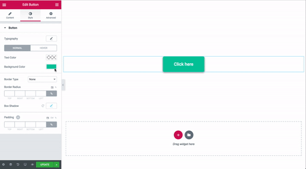
Style Tab

How to Create Gradient Backgrounds for Buttons
